Can Starbucks Make 23,000 Coffee Shops Feel Unique?
YEARS AGO, EVERY STARBUCKS FELT EXACTLY THE SAME. NOW DESIGNERS ASK, CAN 23,000 STARBUCKS FEEL LIKE 23,000 DIFFERENT COFFEE SHOPS?
At Starbucks's global headquarters in Seattle, a designer quietly ushers me down a shadowy hallway, tucked behind a room filled with boxes and photocopiers that it appears no one ever uses. We reach an office with the blinds drawn. She glances around, pulls a key from her pocket, and waves me inside. We shut the door and turn on the light. The room is barely bigger than a closet, finished in drab blue carpet and dull white paint. Every square inch of its walls are covered in photos of fixtures and furniture, fabric swatches, metal fasteners, and samples of wood. There are hundreds of images, possibly a thousand or more, linked together by a carefully plotted string of yarn, like some serial killer map out of a crime drama.
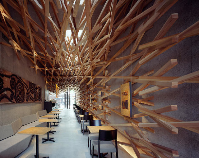
Each string is labeled with adjectives: words you associate with any Starbucks, like “sincere” and “warm,” along with words you probably don’t, like “elegant” and “curious.” Starbucks builds some of the most architecturally stunning coffee shops in the world. In a historic bank on Rembrandtplein Square in Amsterdam, a ceiling undulates with 1,876 blocks of Dutch oak. On a double-decker train car in Switzerland, a 50-seat Starbucks with table service allows commuters from the Geneva Airport to unwind. On a street in Dazaifu, a small city in western Japan, a latticed shrine pays tribute to the god of learning. Each location is a gorgeous piece of design that makes a strong nod to its context. It just so happens that they also sell coffee.

The genesis of those incredible global locations lies in this glorified broom closet. Inside lives every aesthetic idea being considered for the guts of each of the more than 23,000 Starbucks stores worldwide. These early-stage concepts are off-limits even to the vast majority of Starbucks’s own designers: Not until the collection is finalized and compiled into what the company calls The Catalog, a mix-and-matchable compendium for global designers to decorate their coffee shops worldwide, will they see what I’m seeing.
This may be the most important room at Starbucks HQ. Because this is where the $58 billion company (market cap) is trying to solve one of the most bedeviling challenges for any business that grows as large it has: How can Starbucks use design to make every store feel not like a mass-produced product out of Seattle, but rather a bespoke, local coffee shop? And do it within a language that still lets you know where you are?
THE ELEMENTS OF STARBUCKS DESIGN
Back in the coffee surge of 1995, when Starbucks was opening multiple stores a day, the company wanted to avoid absolute homogeneity. So executives designed four different store aesthetics around the elements air, earth, fire, and water, then filtered them through coffee jargon to become aroma, harvest, roast, and brew. The brew store, for instance, was grounded in blue and gold tones, because it was inspired by the story of Captain Ahab’s first mate, Starbuck, as well as how oceans move coffee around the globe. (If this sounds like a lot of corporate hokum, we wouldn’t argue with you.) If you set aside their aspirations to narrative, what really mattered about the brew store was that its components could be simplified into a kit of furniture and finishes, and they could easily be shipped out on a truck to a new location. It was efficient customization.
As Starbucks continued to expand rapidly, though, the compromises of scale strained that four story vision. Soon, the demands of getting new stores online were such that the designs were being mashed together. In effect, they would effectively toss any old chairs on a truck to get the next new store open.

The result, as you may know all too well from your neighborhood Starbucks, was kind of an interior design frappe, in which the distinct components that might cut through the monotony of a global retailer’s thousands of stores were blended into a single concoction by the whirring blades of corporate efficiency. In this way, Starbucks’s design ethos, such as it was, became a harbinger for other problems that were coming to light in the business in the mid-2000s. Starbucks’s identity, formulated as a simulacrum of the Italian cafe, was being lost to a relentless focus on growth and profitability rather than experience. Lines backed up as baristas made a growing list of complicated blended drinks, often incorrectly. The joy of a morning coffee with a smile was lost as automated machines took over for the humans. The air grew rank with the stink of egg sandwiches. And Starbucks stock took a tumble, too.
GETTING THE BAND BACK TOGETHER
Rubinfeld, who’s now president of global development, then wooed back one of his former lieutenants, Bill Sleeth. At the time, Sleeth was in Chicago leading store design at Potbelly, the aspiring, um, Starbucks of sandwiches. Sleeth is now VP of design at Starbucks, overseeing 350 designers and architects in 16 offices around the world, who are responsible for not only Starbucks stores, but also new Starbucks properties such as its juice concept Evolution Fresh and its Teavana tea emporiums.In 2008, on the precipice of the subprime mortgage crisis,Howard Schultz returned to Starbucks as its CEO after an eight-year hiatus. Over the next few years, Schultz made a number of moves trying to restore what he referred to as Starbucks’s soul. He shuttered hundreds of underperforming stores; he abolished automated espresso makers, explaining to senior management that handcrafted espresso was key to the “romance and theatre” of a Starbucks cafe; he closed 7,100 stores nationwide for three hours to retrain baristas in pulling those shots of espresso; and he brought back some of the original talent that drove the mega Starbucks expansion in the 1990s, including Arthur Rubinfeld.
Sleeth has the mix of sharp features and casual grooming that peg him as a corporate creative. He has that skill of listening with real intensity, even when interrupted, before segueing back perfectly to his original point. And his voice maintains a constant hushed urgency, always spoken just loudly enough for you to lean in and hear. We sit together in a coffee house dubbed Roy’s in Seattle’s ritzy Capitol Hill district. The space is straight out of a Dave Navarro video, with red velvet seats and chandeliers constructed from sharp black metal. I’m sipping what is one of the best cups of coffee I’ve tasted in my life, a pour-over preparation of a very limited George Howell roast that’s brewed as light as tea and tastes like toasted grass.
If Sleeth hadn’t told me, I’d never had known Roy’s vampire-approved environment was actually a Starbucks that had opened as an experiment in 2007. Similarly, I’d never had known that Sleeth and the Roy’s staff have a wonderfully sensitive taste in coffee--completely contrarian to Starbucks’s palate-numbing dark roasts--had he not demonstrated his street cred by ordering for us.

Roy’s is clearly a store designed to subvert expectations of what a Starbucks can be, and it is a well-worn stop on the tour of any journalist who visits the company. [See Danielle Sacks’s feature The Multimillion Dollar Quest To Brew The Perfect Cup Of Coffee and our 2012 Starbucks feature, both of which feature visits to Roy’s and the requisite “I can’t believe this is a Starbucks!” moment].
What’s curious is that Rubinfeld dropped Sleeth off here amidst their negotiation process back in 2009, knowing that Roy’s might be able to woo him in a way that Rubinfeld alone couldn’t. At the time, Sleeth was making relatives in Portland, Oregon, ship him Stumptown coffee each week--at the time one of the hottest indie labels in coffee--and couldn’t imagine drinking the Starbucks Kool-Aid if he wasn’t drinking Starbucks coffee. The zealots at Roy’s, with a passion for pour over and hacking $11,000 Clover coffee machines to override automated brewing controls, won him over, even though Sleeth jokes that Roy's is "a little gothic, yes?" when we first sit down.
The strange, ‘90s rockstar vibe of Roy’s offers me the perfect rationale to ask Sleeth about the elusive “Starbucks Experience.” What is it, really? What makes a Starbucks a Starbucks?
The green aprons, he responds. The “engine,” as he calls it--the way you walk through the line, passing by the pastries, checking out, and waiting for your drink. Those elements are always the same. And the coffee, of course.
Roy’s breaks at least two of these three rules. But then again, today, Sleeth is thinking about Starbucks less in terms of stringent brand standards and more as a kind of intrinsic feeling. He wants to foster more of what people call “my Starbucks” and less what people call “that Starbucks.” That’s not only what Roy’s does, but all of Starbucks’s most successful stores. People personally identify them as theirs, they feel some connection to it, and even ownership over it.
“Sometimes when you look at the 'my Starbucks' and the 'that Starbucks,' you’ll see there’s really something different between them,” Sleeth says. “The my just feels more comfortable. It feels more natural.”
BUILDING MY STARBUCKS
When Sleeth returned to Starbucks in 2009, he inherited what was then a new collection of three distinct store designs. Heritage celebrated patina, with worn wood floors and reclaimed timber facades that fit Starbucks in historic buildings. Regional Modern leveraged light-filled loft aesthetics to feel like an architecture studio, to feel like the perfect creative space in urban, commercial buildings. Finally, there was Artisan, inspired by an artist’s studio, with world market furnishings and exposed steel beams.
At this point, he figured out something fundamentally wrong with the Starbucks approach to store design that may seem obvious in retrospect: Whether it’s four types of Starbucks modeled after the elements, or three types of Starbucks named like J.Crew collections, when you scale those few designs to tens of thousands of stores, they would quickly feel generic anyway.

Much of the international design team had already recognized this problem and had tacitly begun to mix and match within the three Starbucks palettes when sharing their concepts for new stores. “Our designers were already going, ‘Well, it’s kind of Artisan with a little Heritage, with one Regional Modern piece,” Sleeth explains. “The best Starbucks are eclectic,” he says, explaining their rationale. “Like an interesting person who has collected things from around the world, you’ll see all kinds of stuff in our best stores.”
Duly inspired, Sleeth threw out the idea of kits and palettes altogether. He organized the existing three Starbucks collections of furniture, fixtures, and finishes into one massive, interoperable database called The Catalog. About 100 items in it are recognizable Starbucks staples, sturdy furnishings like their classic schoolhouse chair or the brick back-splashes behind their bars. Another 50 to 80 items make up what the company calls its “collection”: These are its more aggressively styled fixtures, art pieces, and the like that are refreshed every six months, akin to a spring and fall collection. The end result is a symbiosis of the kind of stringent operational structure you’d expect from a company that generated more than $14 billion in revenue last year combined with a soft creative touch. Ironically, you won’t find anything as outre as Roy’s black chandeliers in The Catalog. Not this season, at least.
At this point, Sleeth’s strategy seems to have forked. In one direction, his team began to see what was possible with big budget customization, and began to build all of those aforementioned architecturally and experientially wondrous flagship stores that celebrate local culture and customs. What’s notable as well is that these Starbucks flagships make money. These aren't loss leaders designed merely to create a halo for the ho-hum drive-thrus built inside failed Arby’s franchises. The crazy customized ideas are held to the same revenue expectations as other stores. In a way, they prove the value of mass customization . . . though you couldn't drop a 4,300-square-foot Starbucks, with fixtures crafted by 30 local artisans, into a rest stop off I-80 as you’re zooming through Indiana on the way to Chicago.

Which is why, in the other direction, Sleeth’s team spearheaded a new style of Starbucks that allowed the company to penetrate low-traffic markets, a mass produced, mass customizable, LEED-certified coffee hut resourcefully wrapped in regional materials. Its inspiration? A spare shipping container. That aesthetic is probably not a coincidence given that Starbucks HQ backs to a massive shipping yard housing thousands of such containers, meaning that even its mass-manufactured idea was, in essence, locally inspired.
Somewhere in between these two extremes--of big money, fully custom build-outs and budget-friendly, mass-customized shipping containers, sits the future of your typical corner Starbucks, and the fairly heady, ambitious attempt at “mass localization.” Rather than translate the Starbucks Experience into a few flagships or three or four replicable formulas, Sleeth’s goal is to create more than 21,500 unique coffee houses that feel like they were born from and belong to the local culture.
BACK IN THE CLOSET
I’m standing in that secret room, looking at the latest candidates for The Catalog, attempting to memorize everything that I see, tracing the precise lines of hand-blown glass fixtures, focusing my eyes on a particular shade of green that I hope to burn into my retinas to see if it becomes a trend.

There were certainly some “warm” pieces in here. “Elegant” ones, too. But wasn’t I looking at the apotheosis of a design slurry? How was the one Starbucks catalog today fundamentally any different than the monotonous, single-aesthetic approach Starbucks introduced in the late '90s? Wasn’t Starbucks just repeating itself?
The difference, I’m told, is that ideas don’t just flow out of this room to the rest of the globe. Sleeth opened the secret room’s door (figuratively!) for new ideas from his offices around the world. Rather than Starbucks Seattle dictating the complete look and feel of a Starbucks in Tokyo, the Tokyo design studio was given the budget to source regional goods that make sense in a Tokyo coffee shop. And Tokyo’s best ideas might even be sucked back into the Starbucks catalog.
A perfect example of this two-way cultural significance might be in Brazil, where a tropic climate has pulled people outside, and in turn, local Starbucks designers have built out patios, complete with custom furniture, that resonate with the sun-loving locals in ways that rich indoor furnishings don’t. Now, Starbucks Seattle is absorbing these fresh patio ideas back into their catalog of global design.

“I want people to feel like it’s their Starbucks,” Sleeth reiterates. “A small percentage of that is identifiable; a lot of it is intangible. That’s why I’d rather put it in the hands of a local designer than to try to crack that code from here.”
Of course, even on the local level, style and culture can still change on a whim. The last thing Starbucks needs is to have their haircut trapped in the Friends era. That’s why Sleeth is also pushing his designers and supply chain to operate with the expediency of the fashion industry.
“Ideally, we’d kind of have a cadence, where we’d introduce a collection, and then we would augment it,” Sleeth says. He imagines every Starbucks constantly swapping in fresh pieces here and there to remain relevant and surprising. “We don’t just take the new thing and ignore the old thing,” Sleeth explains. “We want it to be like this”--he twists his fingers--”so we would show the new collection integrated with the old stuff.”

That seamless integration can be accomplished by manufacturing new items, but it can also stem from good old-fashioned repurposing, too. What ships globally as an unfinished chair may, with a bit of stain, become a walnut chair in Brazil, and then, seasons later, with a fresh coat of paint, a neon orange seat. Upcycling is an old idea to home makeover shows, but a somewhat radical, and more sustainable one for a global corporation.
When you consider that such constant, micro-branded decisions are being made by local designers, it only cements how important the interplay between the Starbucks mothership and its regional offices will be, and how this mass local model--sink or swim--could spread to other multinational companies into the future.

“In my mind, a big idea, the Holy Grail--which is probably unattainable--is mass customization,” Sleeth says. He’s assessing every item in Starbucks’s catalog for its likely shelf life. The more timeless pieces, like that classic schoolhouse chair, will be mass produced at the global level. Items with a three-to-five year lifespan will be made and distributed regionally. And the extremely trendy pieces can be purchased by designers locally, where they are swapped in and out more rapidly. “If we can develop an approach to it at our scale,” Sleeth says, “we can help the whole industry move in the right direction.”
STARBUCKS EVERYWHERE BUT NOT, LIKE, SUFFOCATING
Earlier that day, I got a taste of exactly how important mass customization could be in a world owned by Starbucks. As I walked with Sleeth through the posh University Village mall, amidst such high-end retailers as Tiffany’s, Jonathan Adler, and Apple, we visited three (of four!) Starbucks in this single locale.
The first was a quick in-and-out store designed for commuters, with a few tables pushed to the side walls, with lots of open space reserved for a queue of people. Another was a massive space with multiple tiers of seating and hand-written chalkboard menus that attracted the Posh Mommy set. The third was a gorgeous storefront, wrapped in finely finished, floor-to-ceiling wood-framed windows. At night, there's wine and tapas on the menu. (Apparently, the fourth was inside a grocery store, and relatively unexciting, so we didn’t even bother.)
If four locations sounds like a lot of Starbucks to have in one relatively confined space, know that the mall also contained a Teavana and an Evolution Fresh. In other words, if you ever find yourself thirsty at University Village, there was virtually no liquid you can drink that isn’t owned and curated by the greater Starbucks brand.

This multi-faceted approach is the future of Starbucks. If Starbucks’s strategy since Howard Schultz’s return has been to clarify and reinforce the Starbucks experience, its newer strategy has been to expand what that means across new brands (and then cross-pollinate the best ideas across all of Starbucks’s properties). In the past few years, Starbucks has purchased San Francisco’s famed La Boulange Bakery, along with the aforementioned tea chain, Teavana, and the juice company Evolution Fresh. And the same Seattle Starbucks design team that coordinates coffee shop-design is also in charge of these spinoffs.
As we toured that tapas-serving Starbucks, Sleeth caught glances from quiet coffee drinkers as he pointed out all sorts of little experiments his team was running inside the evening store. There’s a checkout counter that’s a few inches lower than norm, which was designed to make the register more approachable--and in fact, it appeared to do just that. The pastry case is open air and grounded with white marble, akin perhaps to what you might see at Le Pain Quotidien. It felt suitably luxurious, though it seemed like the pastries might dry out more quickly. If these ideas perform well, proving both practical and contributing to a store’s bottom line, Sleeth intends to use those insights at Teavana or Evolution Fresh as well as other Starbucks. It’s as if Starbucks is building a giant pinball machine of design, hoping to boost their score as an idea bounces from one property to the other.

Now, you might be thinking, isn’t the pinball philosophy at odds with mass localization? To an extent, you’re right. But what’s missing is how these ideas are implemented. Walking through Evolution Fresh, there’s no confusion between its gleaming white surfaces, brushed chrome chairs, and bright LCD menus and the warm wool sweater that is your typical Starbucks. Yet splashes of wood paneling along the refrigeration case and bar work wonders to cozy up Evolution Fresh. The wood that’s a dominant gene in a coffee shop is a recessive one in this juicery. And it works in both places.
As unhip as it may sound, chains give us comfort through their consistency and familiarity. As Sleeth put it, he wants to make every Starbucks a “my Starbucks.” But there’s a reason the “my” is the tiny part of that phrase. There may be some cachet to sit in Roy’s and be in the know that you’re really at a stealth Starbucks, but there’s a point of diminishing returns to the bespoke experience. Most people just want to know that they can sip their favorite drink from a comfortable table, with a spot to plug in their laptop, anywhere in the world that they may be. That’s the power of great branding.Remember: Sleeth knows that his Holy Grail of mass customization is unattainable. Indeed, it would be devastating in some ways if it came true. Because Starbucks is an engine and 23,000 locally owned, operated, and designed coffee shops could never be the brutally efficient caffeine and treat-time delivery systems they are without global control. It’s why Starbucks took over the world in the first place.
Starbucks will inevitably fail at true mass customization because it’s impossible to scale and implement. But getting just halfway there may be a better proposition anyway. Because “sincere,” “warm,” “elegant,” and “curious”--these aren’t bespoke design concepts. They’re universal.
No comments:
Post a Comment