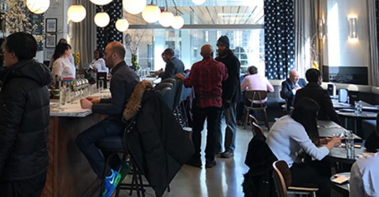
Whole Foods' Harbor Bar in Midtown Manhattan was created in partnership with Chef Daniel Boulud. The raw bar offers oyster towers, lobster rolls and seafood-centric small plates.
Supermarkets, c-stores use design to erase the line between retail and dining
NRA Foodservice @ Retail Summit session: “This is where supermarkets need to take food”
Supermarkets and c-stores looking to get in on the dining game can build on some key elements of restaurant design to create a dining experience customers will seek out. At the NRA Show’s Foodservice @ Retail Summit in Chicago, two leading voices in the grocerant design world, Juan Romero of aPI, a design firm, and Tré Musco of Tesser, a brand strategy design firm, presented on the topic. Nicolas Granucci of Ecolab moderated the session.
Romero and Musco shared important design ideas and details to know if you’re looking to make your supermarket or c-store a destination where customers feel welcome to stay, dine and enjoy.
 Left to right: Tré Musco of Tesser, Juan Romero of aPI and Nicolas Granucci of Ecolab
“Consumers care about what the experience is like, and 90% of the information sent to the brain is visual,” Musco said. “People form judgments instantaneously. In terms of design, perception is reality.”
If a c-store or grocery store — known as a place to get gas or groceries — is to become a place to enjoy a meal, that means customers must perceive it as such.
“This is about leveraging your environment to create memorable experiences,” Romero said. “Customers can spend the whole day eating and enjoying [in a supermarket]. There’s an entertainment value that’s happening in grocery design. The concepts inside supermarkets can go anywhere from fast casual to elegant to urban.”
Romero described his epiphany 12 years ago when he visited a brand-new, 80,000-square-foot Whole Foods in Austin, Texas.
“There was excitement everywhere … the graphics were together, the architecture was together … I saw an island with a bar setting and chairs, a juice maker, salads and adult beverages,” Romero said. “It dawned on me that this is where supermarkets need to take food.”
Borrowing design elements from the restaurant world is part of the process of creating a destination-dining environment within a supermarket or c-store.
Musco theorized that traditional restaurants deliver on three core consumer needs: care, convenience and quality.
“Grocerants tend to miss out on the care aspect, that sweet spot of comfort,” Musco said. He offered five ways that grocery stores and c-stores can bridge that gap:
- Lead with change: “Consumers think of you in one way and have a hard time shifting gears,” Musco said. He pointed to a new Sheetz dining room with an up-front kitchen and inviting dining room, a warm comfortable environment that makes a radical departure from old-fashioned gas station. “We learned early on that we had to go way forward with the change so heritage brands won’t get stuck in a certain place in consumers’ minds.”
- Be a place to recharge: “People think of lunch and dinner as mini breaks, so set up your interior as a place to stay and feel comfortable,” Musco said, suggesting comfortable lounge seating, warm lighting and great music as ways to create that restorative environment. Big no-nos include cavernous spaces that look like a fluorescent-lit office. Go in the direction of richer and warmer.
- Go with the flow: “If you’re a c-store or grocery store, you know what you’re good at,” Musco said. “But customers know how restaurants work, and that’s not standing in line with the grocery carts.” That means investing in digital technology like app-based ordering from gas pumps, for example.
- Details matter: Details like restrooms should never be overlooked for a dining area within a grocery store or c-store. “Restrooms really matter,” Musco said. “Customers 100% judge your freshness and cleanliness on your restrooms.” Musco showed an example of the San Francisco airport’s bathrooms, which have areas to touch up makeup, guard rails to prevent getting a wet shirt while washing hands and a rack to place bags on while washing hands. Another detail to remember is better lighting on food that’s on display. Make it look as crisp and fresh as possible.
- Dive into the deep end: “Customers don’t want to feel like you’re just adding a couple of tables because you had a little extra space,” Musco said. Your supermarket dining area should feel like a dedicated space, not an afterthought or add-on that was hastily thrown together. He cited Kroger’s Fresh Eats as an example of a place that’s “as fresh as Chipotle and as good as your favorite $14 salad place.”
To reach these goals, Musco encouraged getting feedback from not just customers, but team members and managers along the way. They will be your eyes on the ground as to what’s working and what isn’t in regards to lines, flow and the overall operation. He also encouraged making bold moves and investing in the long run.
“Don’t cheap out on materials for tables, chairs and floors,” Musco said, pointing out that today’s customers are fine with old-school materials like wood, marble and stone that get a patina over time. Plastic may be easy to maintain, but older materials have more authenticity in consumers’ eyes.
Another key point is to get everyone on your team (food and beverage, real estate, architects, financial people) in on every part of the process.
“This is a team sport,” Musco said. “Get it right the first time, because it takes a lot of capital and time to redo it.”
Also, don’t just focus on your new flagship/prototype stores, but instead think, “How is this [dining space] going to go into a 30-year-old store that has a weird footprint?” Musco said. “Value your assets as a grocery store and play that up.”
No comments:
Post a Comment